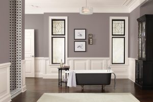
New neutrals dominate the color trends of 2017
Home decor: The hottest colors of 2017
 (BPT) – From furniture to walls, new homes to remodels, cool grays have dominated home design palettes for the last five years. Look to 2017 to gently shake things up with a focus on fresh neutrals that bring warm and cool tones together to create versatile color with timeless appeal.
One of the most notable trends of the year is the transition of neutrals from monochrome gray to warmer hues, including complex taupe, beige, khaki and brown colors. These warmer tones create an inviting feeling, and while grays will continue to be popular, look for hybrid hues that blend the best of gray with warmer undertones for colors that are unique, yet familiar.
The perfect example of this trend is Poised Taupe (SW 6039), the Sherwin-Williams 2017 Color of the Year. Earthen brown combines with conservative gray resulting in a weathered, woodsy and complex neutral that fits well in virtually any room.
“Poised Taupe celebrates everything people love about cool gray as a neutral, and also brings in the warmth of brown, taking a color to an entirely new level,” says Sue Wadden, director of color marketing for Sherwin-Williams. “Not cool or warm, nor gray or brown, Poised Taupe brings a sense of coziness and harmony that people are seeking.”
If you’re looking to refresh your space with this new color trend, there are countless opportunities. Here are four stunning home decor themes using this up-and-coming color:
Cornflower hues
With its cool-yet-warm vibe, Poised Taupe is an ideal complement to cornflower hues. For example, when paired with the faded indigo of Stardew (SW 9138), it creates a charming palette ideal for French countryside aesthetics. This fun twist on a classic is sure to produce timeless results in the kitchen or living spaces.
Organic re-imagined
Create an updated nature-inspired palette in your home with citrus green, weathered bronze, mustard yellow and light, cool-toned blue paired with earthy neutrals like Poised Taupe. This contemporary organic look is perfectly re-imagined for the modern world with just the right amount of visual appeal.
Wine and taupe
Saturated color pairings that evoke deep moods are gaining popularity. Taking cues from baroque and romanticism designs, the Sherwin-Williams Noir palette is rich with colors that are reminiscent of vine-ripe fruits, dramatic wine colors and deep blues. Balance this mysterious palette with a neutral like Poised Taupe and you’ll have a look that is unexpected and gorgeous.
Yellow pop
Gray tones always provide a clean, modern base, but contrasting these hues with vivid colors allows you to transform any room into a contemporary paradise. Try using the deep teal of Marea Baja (SW 9185) and sunny hued Bee (SW 6683) alongside Poised Taupe to create a graphic look perfect for the office or kids rooms.
Ready to make this the year you update your house with fresh designs and stunning colors? To learn more about top trends for 2017, visit www.sherwin-williams.com.
Published on 2017-01-25 22:16:09

